Native Ad Templates
Native Ad Templates is where you design the actual visual layout a native ad renders with, directly in the Portal, instead of your app supplying a native ad layout in code. This is the Portal-side counterpart to the SDK's showTemplatedNative() call (AdsManager.showTemplatedNative on Android, AppsKitSDKAdsManagerIOS.instance.showTemplatedNative on iOS): a placeholder configured to use a template here is exactly what that SDK call renders at runtime — the app passes no layout resource (no res/XIB) at all, because the design lives here instead.
The Templates List
The Ad Templates page (sidebar, grouped with Brands and Region Groups) lists every native template you've designed as a table.
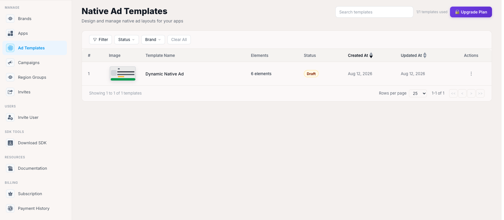
Each row shows: a numbered index, a small thumbnail Image preview of the layout, the Template Name, an Elements count (how many of the available building blocks — icon, title, media, CTA, etc. — the template actually uses), a Status pill (Published or Draft), sortable Created At / Updated At dates, and an Actions menu. A search box filters by name, and Filter, Status, and Brand dropdowns narrow the list further, with a Clear All to reset them. Pagination follows the same "Showing X of Y" footer pattern used throughout the Portal. Click + Create Template to start a new one, or click an existing row to open it in the Canvas editor below.
Designing a Template (the Canvas)
Opening a template — new or existing — takes you to the Canvas editor, where you build the layout element by element.
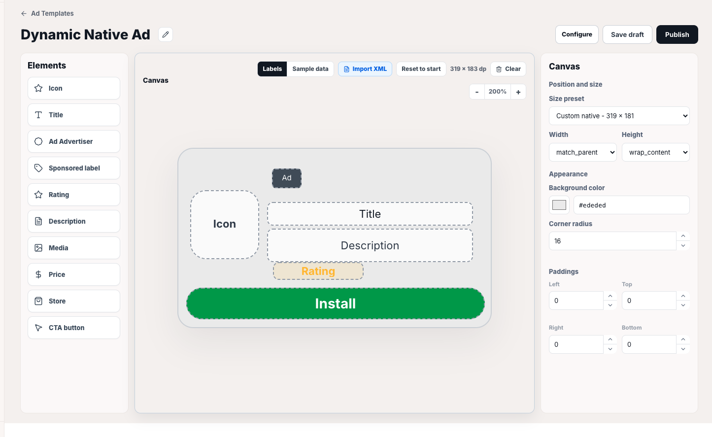
- Elements (left panel) — the building blocks available for a native ad: Icon, Title, Ad Advertiser, Sponsored label, Rating, Description, Media, Price, Store, and CTA button. Only the elements currently placed on the canvas are active (this is what the list page's "Elements" count reflects); the rest stay greyed out in the panel until you add them. This set mirrors exactly what a native ad object can expose — you're choosing which of the ad network's own native ad assets to place and how, not inventing custom fields.
- Canvas (center) — a live preview of the layout at its actual size in dp, with a Labels / Sample data toggle to preview either placeholder labels or realistic sample content, zoom controls, an Import XML option (bring in an existing Android layout instead of building from scratch), and Reset to start to discard changes back to the template's last saved state.
- Canvas properties (right panel) — position and size (a Size preset dropdown, plus explicit Width / Height fields, each independently settable to a fixed value,
match_parent, orwrap_content), appearance (Background color as a swatch + hex value, and Corner radius), and Paddings (Left / Top / Right / Bottom, each with its own stepper).
The Draft / Live toggle next to the title (with an inline pencil icon to rename the template) controls whether it's actually eligible to be assigned to a placeholder yet — a template left in Draft won't show up as a usable option anywhere else. Save changes stays disabled until you've actually modified something, the same no-op-save pattern used throughout the Portal.
Configuring Template Availability
Clicking Configure from the Canvas editor opens the Configure Template Availability modal — this is what actually makes a template usable for a given app or brand, as a separate step from designing it.
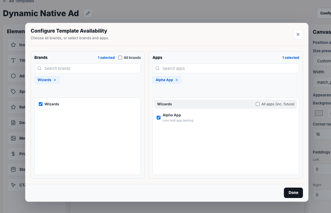
The modal is a two-column picker, structurally the same pattern as the Campaign wizard's Publishing step (the Targeting step's Brands section, "All Brands" vs. specific brands/apps checklist):
- Brands (left) — an All brands master checkbox, or pick specific brands from a searchable checklist. Selected brands are echoed as removable chips above the list.
- Apps (right) — populated based on which brands are selected on the left, grouped by brand. Each brand group has its own All apps (inc. future) shortcut to include every app under it — current and future — without picking them individually, or you can check specific apps one by one. Selected apps are also echoed as chips.
Click Done to save the availability scope. Only once a template is both Live and made available to an app/brand here does it become selectable when assigning a native template to a placeholder in that app's configuration below.
Assigning a Template to a Placeholder
Back in an app's App Details → Ad Placeholders → Ad Units for Ad Placeholders grid (described above, under App Details), the Native column works the same way Interstitial / Banner / Rewarded do — you can add one or more placements per placeholder and reorder them by priority for failover — but it also carries a template icon next to the column header, since native placements need a design assigned, not just an ad unit.
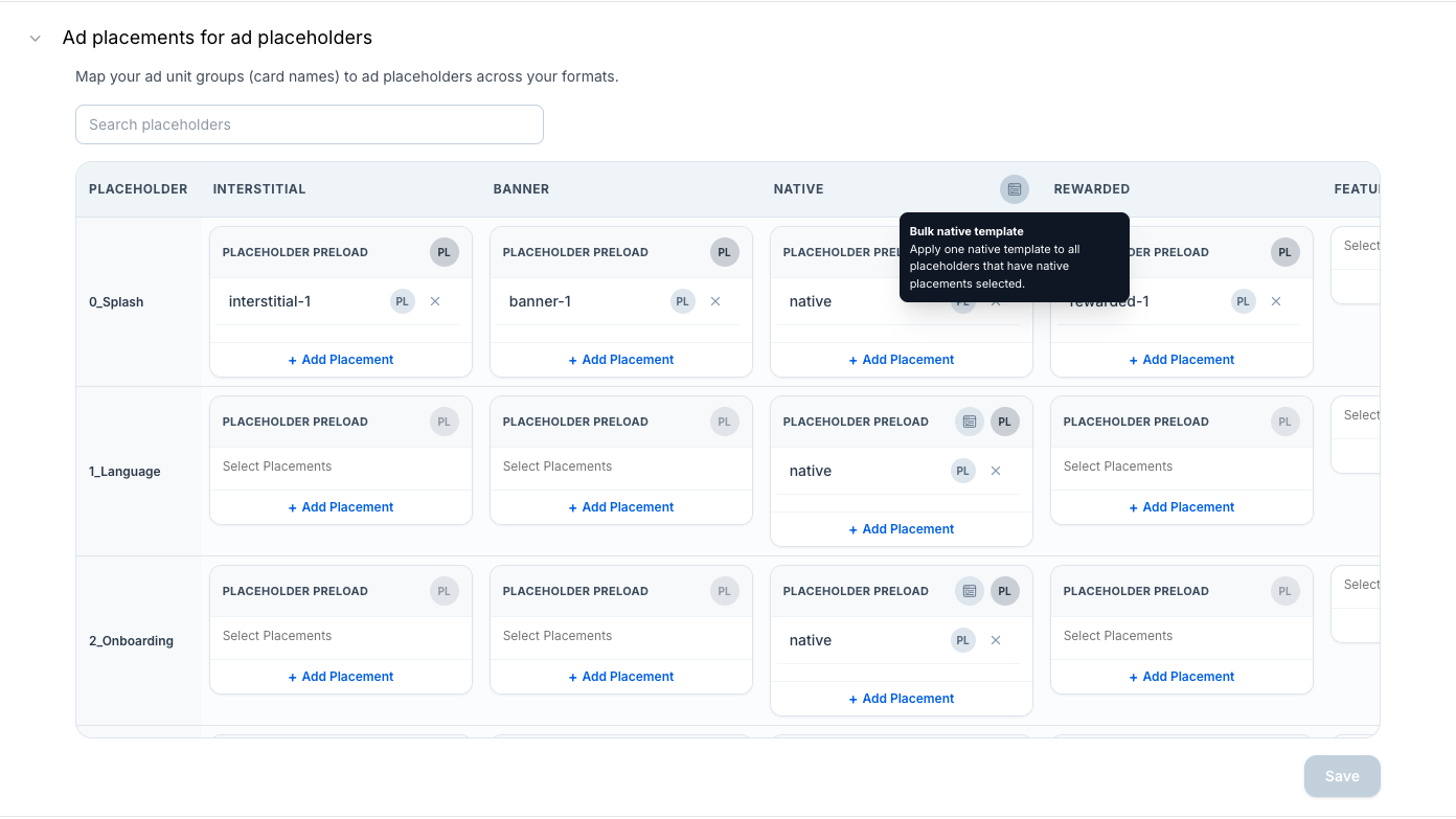
Clicking that icon opens Configure Native Template, scoped to every native placeholder currently shown in the grid (the modal header states the scope, e.g. "All native placeholders (10)").
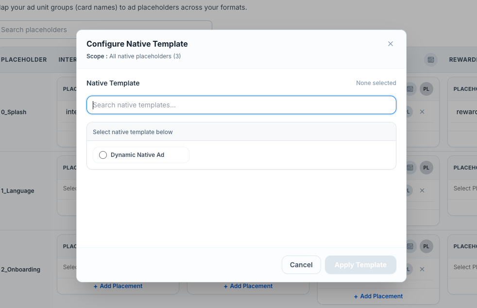
Search for and select one template from the ones made available to this app (per Configure Template Availability above), then click Apply Template to assign it across the whole scope in one action, instead of opening each placeholder's Native card individually. Once applied, any placeholder in that scope that calls showTemplatedNative() at runtime renders using this template's design — this is the mechanism that connects a template you designed here to the actual native ad shown in your app, the same way Cross Promotion (described under Ad Units for Ad Placeholders, in App Details above) connects a Campaign to a live ad placement.