Application Management
My Apps (Dashboard)
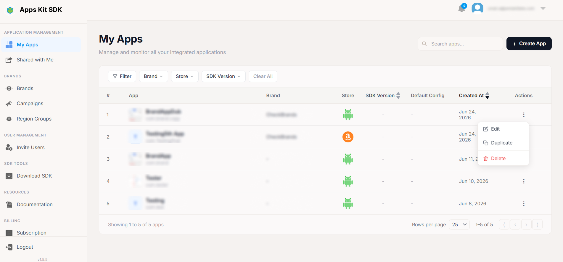
My Apps (/ or /apps) is the landing page after login and the home base for every app your team manages.
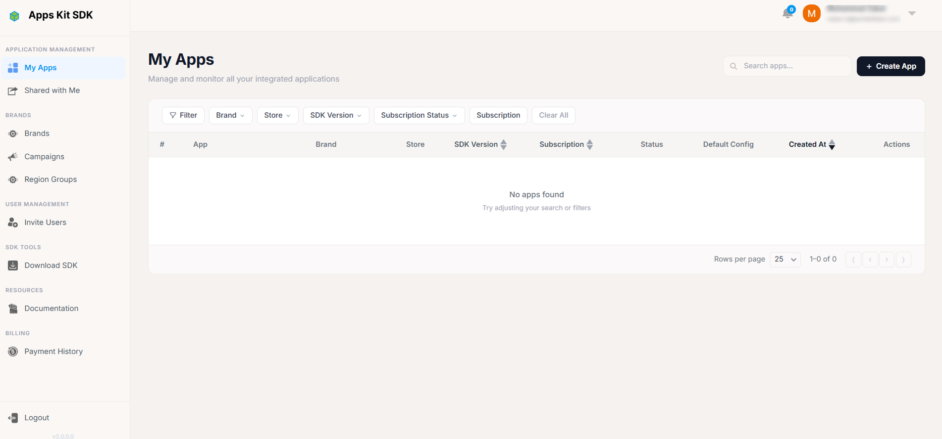
The apps table. Each row shows: a numbered index, the app's icon (or a letter-avatar fallback if no icon was uploaded) plus its name and package/bundle ID, its assigned Brand, its Store (a platform icon for iOS/Android/Amazon), its current SDK Version (sortable), a Default Config status dot (green "Added" if a default configuration has been generated for the app, gray "Not Added" otherwise), its Created At date (sortable), and an Actions column.
Searching and filtering. A search box filters by name/package as you type. Separate Brand, Store, and SDK Version dropdown filters (via the Filter Bar) can be combined with the search. Pagination is a custom "Showing X–Y of Z" footer with a rows-per-page selector and ⟨ ‹ › ⟩ navigation buttons, rather than a built-in table pager.
Actions menu. The three-dot menu on each row offers Edit, Duplicate, and Delete, subject to your permissions (see Plan limits and shared-view permissions below).
Plan limits and locked apps. Your subscription plan caps how many apps you can have (maxApps). If your current app count exceeds that cap — for example after downgrading your plan — an amber warning banner appears at the top of the page: "You're over your app limit — X/Y apps used," with a small progress bar and an Upgrade Plan button linking to Subscription.
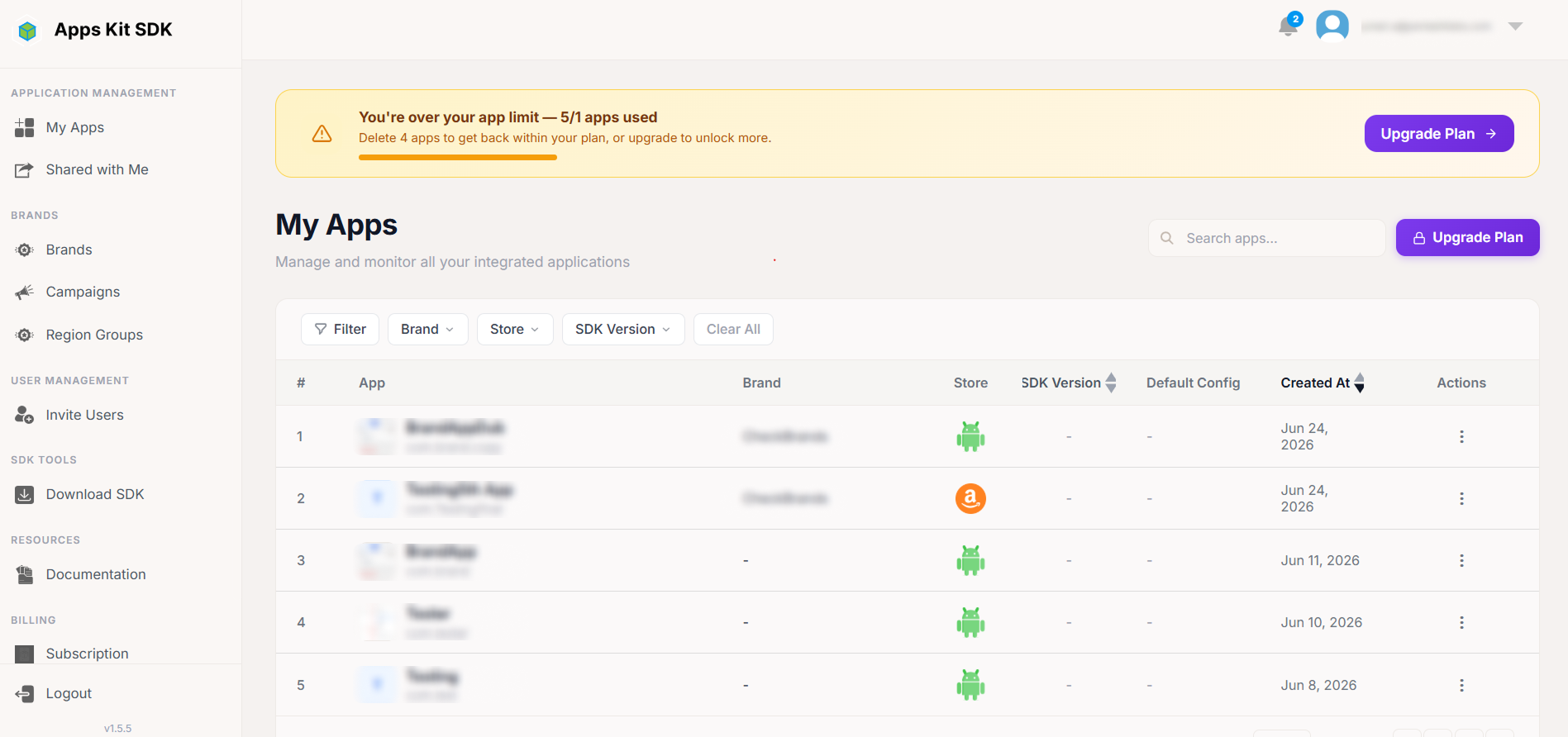
When you're over the limit, the Portal doesn't pick which apps to lock arbitrarily — it keeps your oldest apps (by creation date) usable, up to your plan's limit, and locks every app created after that. A locked app's Actions menu collapses to a restricted version: clicking the three-dot button shows only a "LOCKED" header explaining "This app is outside your plan limit. Delete it to free a slot," plus — if you have delete rights — a red "Delete App" option. Edit and Duplicate are not available on locked rows; the only way to regain access to a locked app is to delete other apps to free a slot, or upgrade your plan.
Create button. The + Create App button is only clickable if your plan still has room (canCreateApp()). If you're at your limit, it's replaced with a small usage indicator ("X/Y apps used") and a "🔒 Upgrade Plan" link to Subscription instead.
Shared/collaborator view. If you're viewing this page in a switched/shared account context (see Account menu above), the table additionally fetches your specific permission rights for that account (via /rights/user-permissions) and uses them to gate Edit/Delete/Duplicate per row — for example, you might be able to view and edit apps but not delete them, depending on what the resource owner granted you.
Adding a New App
Clicking + Create App opens the App form in "create" mode as a centered, vertical modal.
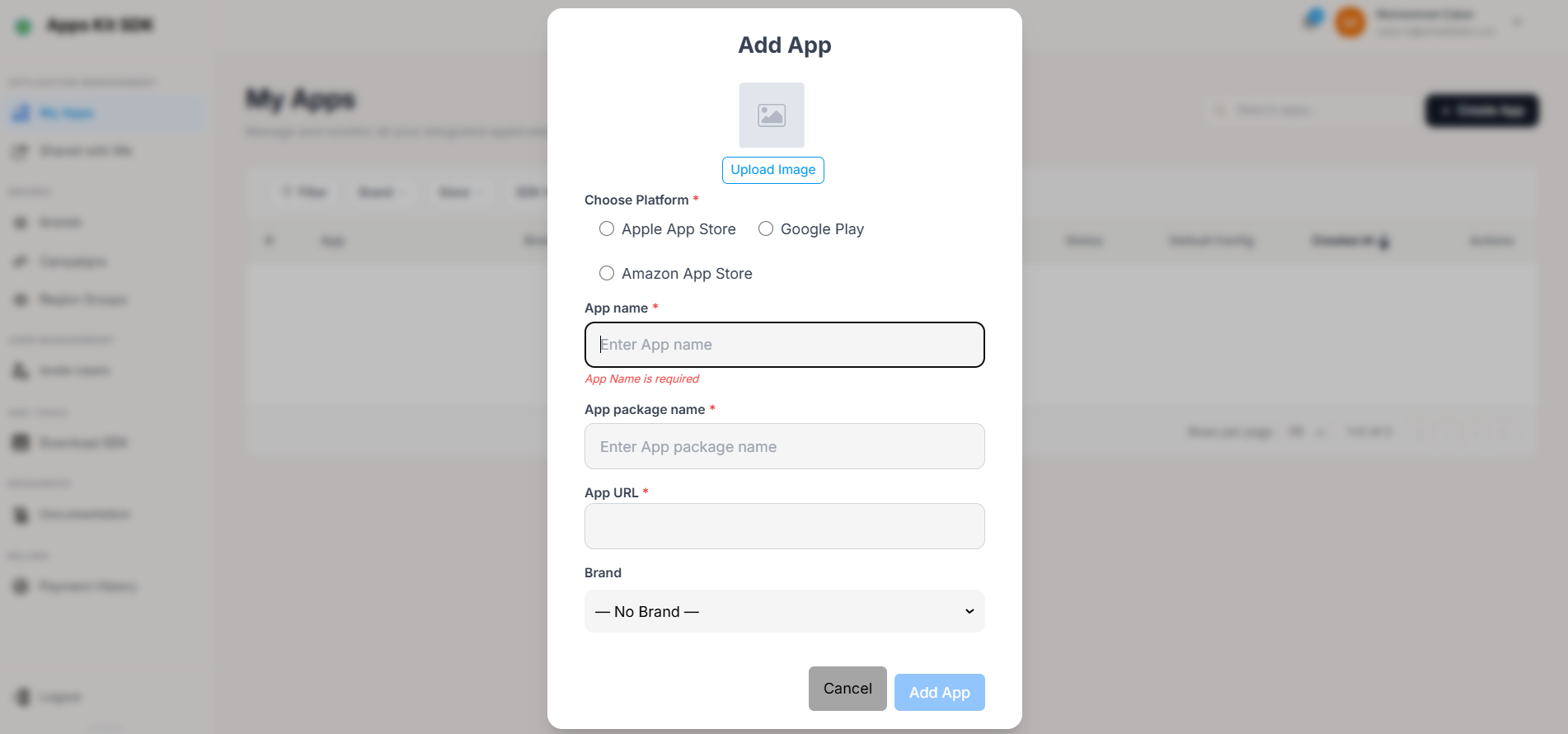
Fields:
- Icon — optional. A large upload square at the top reads "Upload Image" until a file is chosen; accepted types are JPEG, PNG, and GIF.
- Store — required radio selection: Apple App Store, Google Play, or Amazon App Store (loaded dynamically from the backend, with these three as a fallback if that call fails).
- Name — required, 4–70 characters.
- Package / Bundle ID — required, must start with
com.(validated against the patterncom.*). - URL — required on create. Selecting Google Play as the store auto-fills
https://play.google.com/store/apps/details?id={package}; selecting Apple App Store auto-fills the basehttps://apps.apple.com/. You can still edit the URL manually after auto-fill, and changing the package while Google Play is selected keeps the auto-filled URL in sync. - Brand — a dropdown of your existing Brands.
Submitting calls the create-app endpoint, then the app is created with no mediation network or ad units configured — you configure those next, inside App Details. Clicking Cancel closes the modal without saving.
Editing or Duplicating an App (the quick modal)
Choosing Edit from a row's Actions menu opens the same form component in "edit" mode, but laid out as a single compact horizontal row rather than the vertical create layout: icon (with a small pencil-overlay button to replace it), Name, a read-only Package field, a read-only URL field, the Brand dropdown, and a Save button. Package and URL become permanently read-only once an app exists (you cannot change an app's package ID or store URL after creation — only its name, icon, and brand). This row is gated by a canUpdate permission check, which in a shared/collaborator context comes from whatever App Info rights were granted to you.
Choosing Duplicate opens a second copy of the create-mode form, pre-filled from the source app, with .copy appended to the package name so it doesn't collide with the original. You then adjust whatever you like (name, icon, brand) before saving it as a brand-new app — mediation, ad units, and all other App Details settings are not copied over; the duplicate starts fresh just like a newly created app.
App Details
Opening an app (via My Apps → Edit, or clicking the app row itself) takes you to App Details — the most complex page in the Portal, and where the actual SDK behavior for that app is configured.
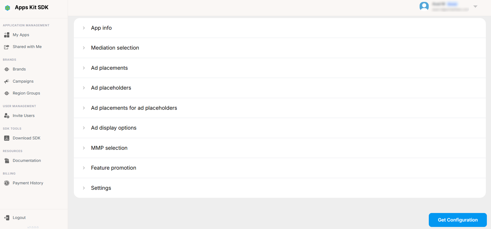
Live vs. Dev mode. A toggle at the top of the page switches the entire page between Live and Dev configurations. Every section below — Mediation, Ad Units, Placeholders, Display Options, MMP, Feature Promotion, Settings — is configured separately for each mode, so you can stage and test changes in Dev without affecting what's currently live in your shipped app. Two buttons, Apply live to dev and Apply dev to live, let you copy one mode's entire configuration over the other in one action (useful for "promoting" a tested Dev config to Live, or resetting Dev back to match Live before testing something new).

The page header also shows the app's current Config Version number, a Change History link (see below), and a Get Configuration button (see below). Some of the configuration UI (and the Region Groups selector mentioned below) only appears once the app's reported SDK version clears certain thresholds (the Portal gates a few newer features behind minimum SDK versions so older app builds aren't shown options they can't actually use).
The rest of the page is organized as a set of expandable sections, in this order:
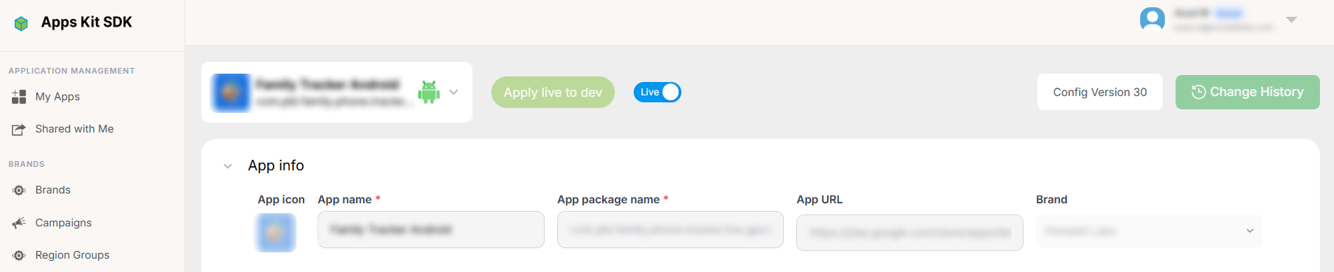
App Info
The app's basic identity: name, package/bundle ID, store, icon, and brand assignment — essentially the same fields as the create/edit App form, surfaced here for convenience.
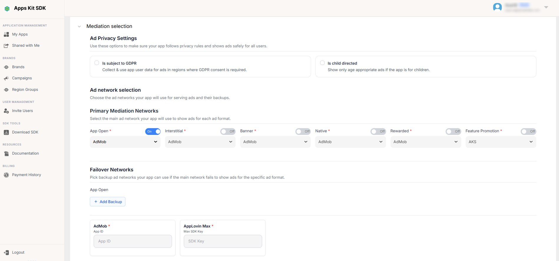
Mediation Selection
Choose the mediation network used for this app/mode (e.g., a waterfall-style network, or AppLovin MAX). This is a gating choice: until a mediation network is selected here, the Ad Units, Ad Placeholders, and Ad Units-for-Placeholders sections below stay locked, because they depend on knowing which network's SDK and ad-unit format you're configuring against.
Add Ad Units
Enter the ad unit IDs issued by your mediation network, organized into tabs by ad format — App Open, Interstitial, Banner, Native, and Rewarded. Only the formats actually supported by the mediation network chosen above appear as tabs.
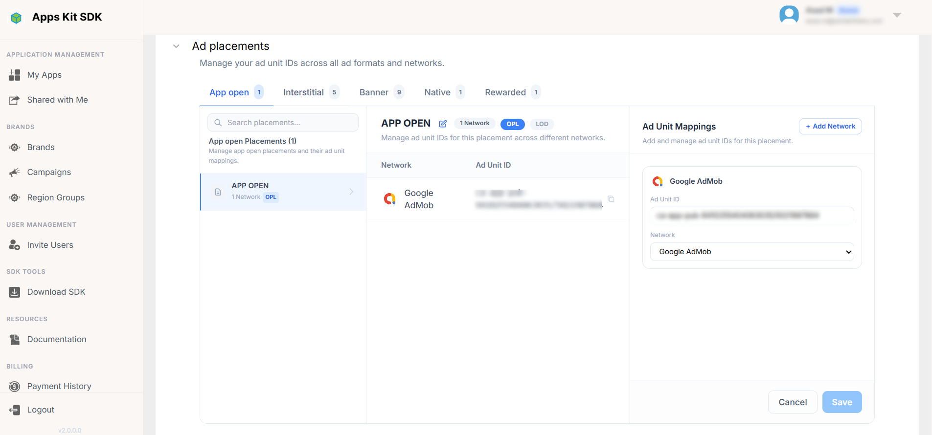
Ad Placeholders
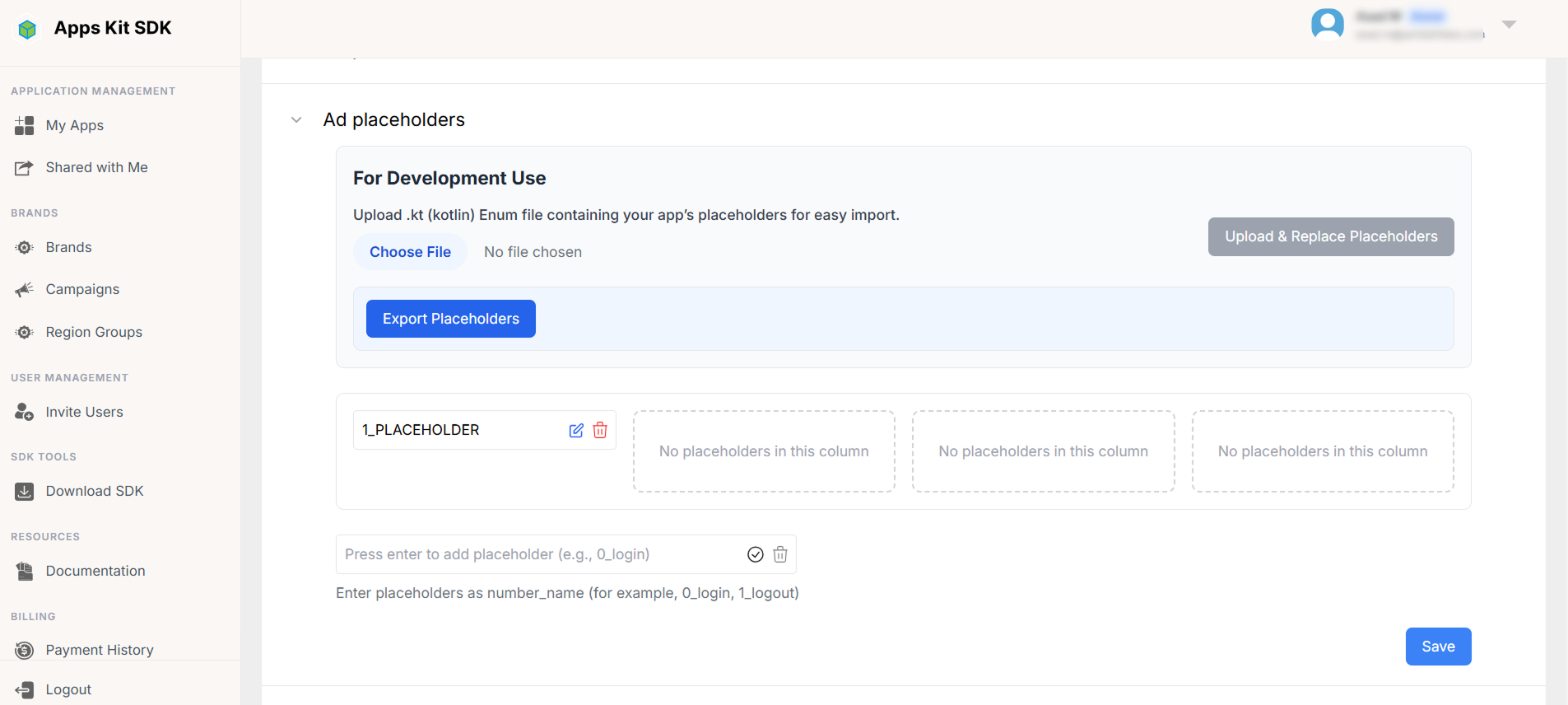
Define named placeholders: the logical slots in your app or game where an ad can appear (for example, "Level Complete" or "Main Menu Banner"). These are presented as a numbered grid you can add to or rename. Because placeholder names typically need to match constants in your app's source code, the Portal supports importing and exporting the whole placeholder list as a Kotlin (.kt) enum file, so your codebase and your Portal configuration can be kept in sync without manual retyping.
Ad Units for Ad Placeholders
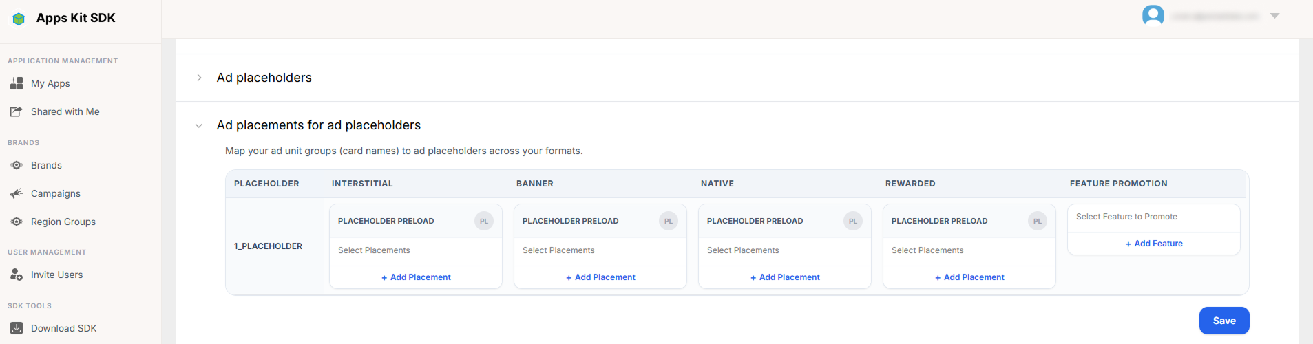
A mapping grid: placeholders down one axis, ad formats (Interstitial / Banner / Native / Rewarded) across the other, where for each combination you choose which specific ad unit (from the ones added above) should serve that placeholder.
Notably, Cross Promotion also shows up as a selectable option in this grid alongside your real ad-network units. Choosing it for a given placeholder means that slot won't show a paid network ad at all — instead it will render a cross-promotion creative from one of your other apps, as configured under Campaigns. This is the mechanism that connects the Campaigns feature to actual ad placements inside your apps.
Ad Display Options
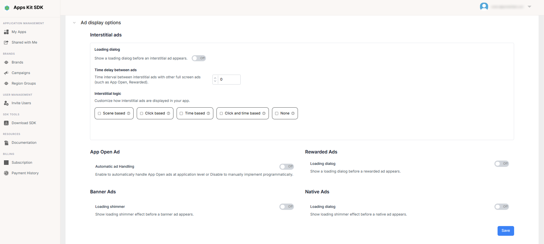
Per ad format, control the loading UX: whether to show a loading dialog or shimmer while an ad is fetched, and a timeout for how long to wait before giving up. Interstitial ads have additional trigger-logic options beyond simple display timing — you can choose to trigger them on click, after a time interval, on a combination of both, or based on in-app scene transitions, and each trigger mode exposes its own tunable parameters (e.g., the time interval, or the click count).
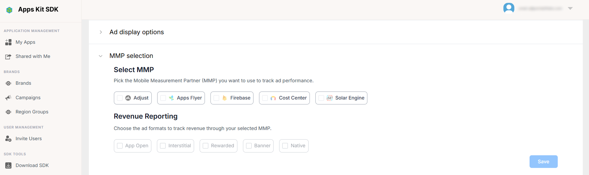
MMP Selection
Connect a Mobile Measurement Partner — options include Adjust, AppsFlyer, Firebase, Cost Center, and Solar Engine — and toggle ad-revenue reporting on a per-ad-format basis so that ad revenue events flow into your attribution/analytics stack alongside the rest of your install and engagement data.
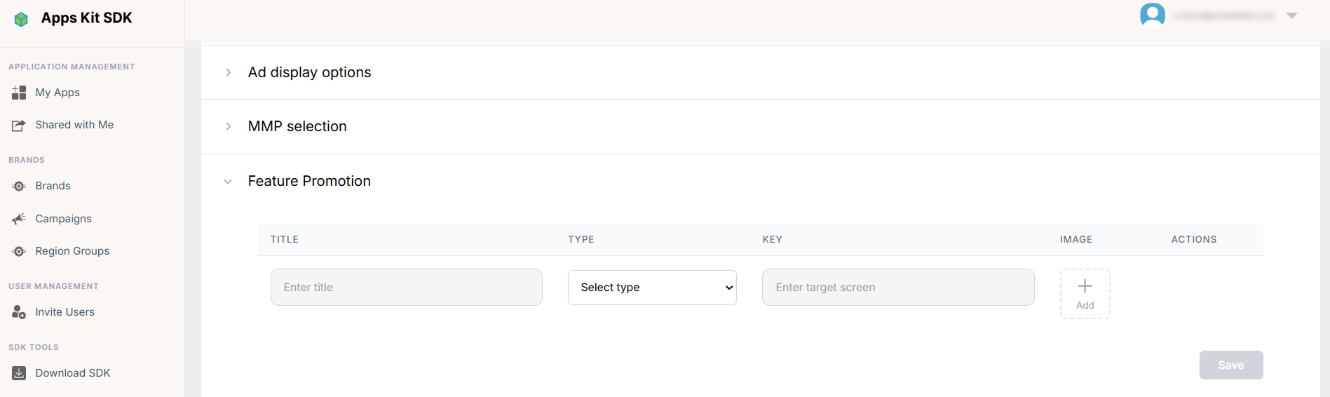
Feature Promotion
Configure in-app promotional banners or cards that are unrelated to ad networks — think "announce a new feature" or "cross-sell a premium tier" inside your own app's UI. Each entry in this editable table has a title, a type, a key, an image, and an action (such as a deep link or an in-app navigation target) that fires when the user taps it.
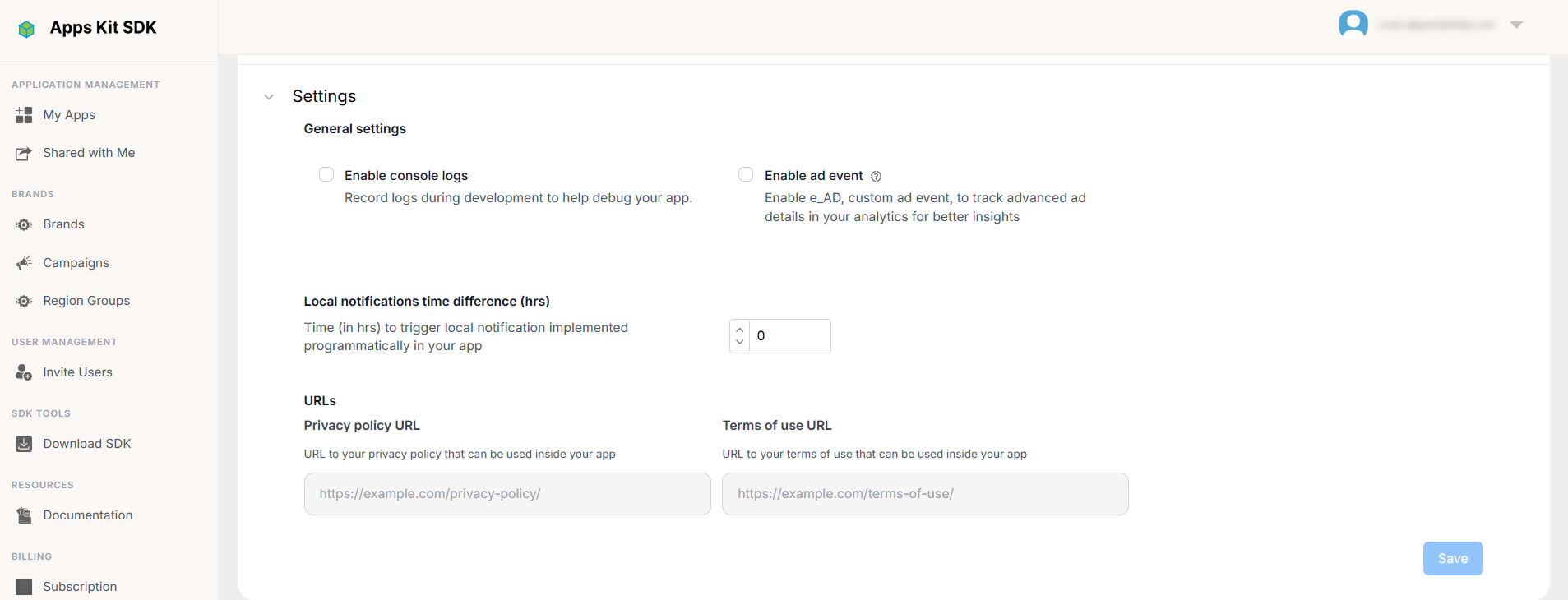
Settings
Miscellaneous app-level toggles that don't fit elsewhere: enabling console logs for debugging, enabling ad-event logging, an allowed local-notification time-difference tolerance, and the app's Privacy Policy and Terms of Service URLs (which some ad networks and app stores require you to surface).
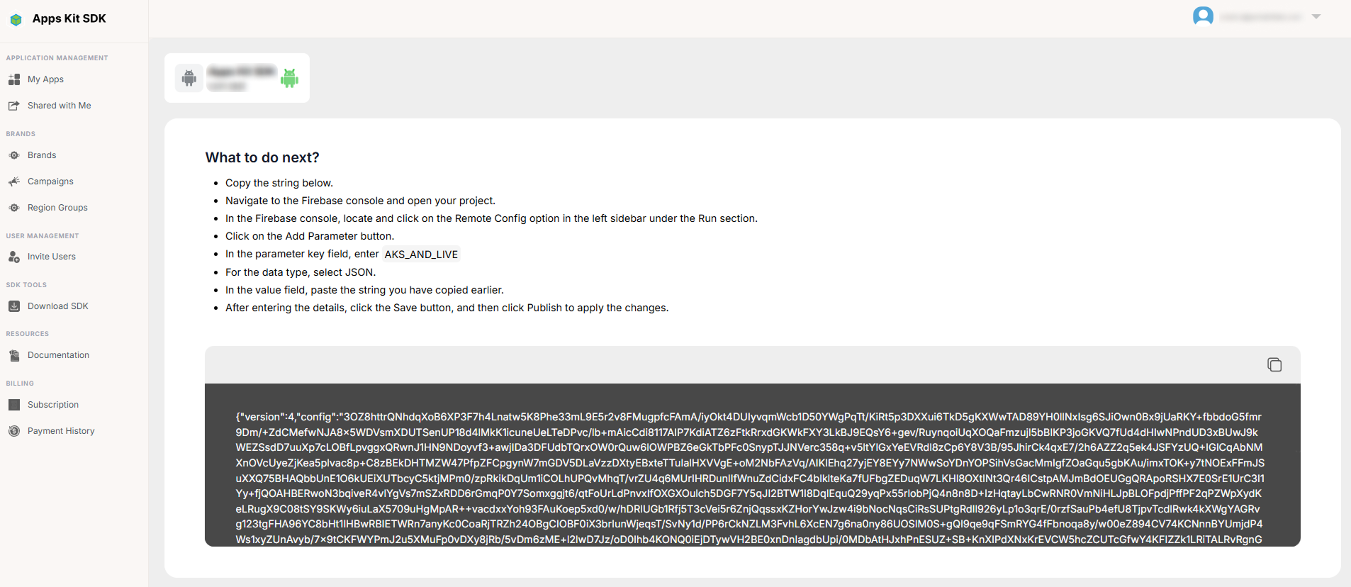
Get Configuration
Clicking Get Configuration generates an encrypted configuration string representing everything you've configured above, for whichever mode (Live or Dev) is currently active. If you have a Region Group selected in the App Details header's region selector, the generated link/string carries that group's ID along as a query parameter, so the configuration that gets fetched at runtime can vary by region group. The Portal also walks you through publishing that string via Firebase Remote Config under the parameter key AKS_AND_LIVE — this is how your live app actually picks up the configuration at runtime, since the Portal itself doesn't push config directly to end-user devices.
Change History
Every time an app's configuration is saved, a new Config Version is recorded. Change History (a dedicated page, reached from the link in App Details) lists every version for that app as a table: a sequence number, the Config Version, a Description of what changed (long descriptions are pipe-delimited internally and rendered as separate lines, truncated with a "Show More / Show Less" toggle past the first 20 characters), the Updated Date, and Updated By. A date-range filter at the top narrows the list to a specific window. This gives you a basic audit trail of who changed an app's configuration and when.

Shared with Me
If another team has invited you to collaborate on their apps and you've accepted, those shared resources appear under Shared with Me (/SharedWithMe) — a table of your received invitations, separate from the apps your own team owns. Each row shows the inviter and the current status of the invitation.

From here you can Accept or Decline a pending invitation. Both actions call the same handle-invitation endpoint with the appropriate decision. Once accepted, that inviter shows up in your account-switcher dropdown (described above) so you can jump into their account and work within whatever permissions they granted.
If you arrive at this page via a notification link containing an ?invitationId= query parameter, the Invitation Dialog opens automatically on load instead of you having to find the row yourself.
The Invitation Dialog. This modal shows the inviting account's email in a pill at the top, and a status-dependent header/icon: a gift icon for a pending invitation, a checkmark for one you've already accepted, an X for a declined one, and a clock for an expired one. Below that is a scrollable "Access to N Resource(s)" list — each row shows an app-icon placeholder, the resource name (e.g., "Apps," "App Info," formatted from the underlying permission key), and right-aligned badges for which rights you'd have on it (Read / Create / Update / Delete). If the invitation has an expiry date, a warning line shows it.
The footer buttons depend on status: a pending invitation shows "Not Now" and "✓ Accept Invitation"; an already-resolved or expired invitation shows just "Close", along with explanatory text (for an expired invite, something like "Please ask {inviter email} to send a new invitation").